10 Color Drenching Ideas for Your Outdoor Living Space: Create a Vibrant Oasis!
If your outdoor space feels a bit lifeless or lacks that special something, it might be time to embrace the bold and beautiful trend of color drenching. This modern design technique involves saturating a space with a single hue or color family to create a cohesive, striking look that makes a serious impact.
While this concept is often used indoors, it’s now making waves in exterior design. From your patio and balcony to backyard lounges and garden nooks, color drenching can completely transform an outdoor space into a stunning retreat bursting with energy and personality.
So whether you’re aiming for cozy and calming or bold and tropical, here are 10 color drenching ideas to infuse life, style, and visual unity into your outdoor living area.
If your outdoor space feels a bit lifeless or lacks that special something, it might be time to embrace the bold and beautiful trend of color drenching. This contemporary design technique is all about fully immersing a space in one dominant color or a close-knit palette of tonal variations. Rather than relying on a mix of contrasting accents, color drenching focuses on creating visual unity and dramatic impact by consistently using shades of the same hue across walls, furniture, textiles, and decor.
Though originally a trend seen in interior spaces—especially in moody living rooms or minimalist bathrooms—color drenching has now moved outdoors in a big way. It’s become a go-to approach for homeowners and designers looking to breathe new life into patios, porches, terraces, and even gardens. Whether you’re working with a large backyard or a tiny balcony, drenching your space in a single saturated tone can make it feel intentional, elevated, and incredibly stylish.

Why does it work so well outside? For one, the consistent use of color creates a bold backdrop that allows architectural features and greenery to stand out more vividly. It also blurs the lines between furniture and structure, creating a seamless look that feels curated rather than pieced together. Plus, it’s a fun and creative way to express your personality—whether you prefer serene natural tones or want your space to scream summer fun.
Color drenching outdoors can be as dramatic or as subtle as you want. For a high-impact effect, you might paint your pergola, fence, and furniture in the same saturated shade, then layer in matching planters, textiles, and accessories. Or, if you prefer a softer take, you can focus on coordinating various elements—like cushions, throws, pots, and lanterns—in a single color family to evoke a sense of harmony without full commitment.
The best part? There are no strict rules when it comes to choosing your palette. From breezy whites and moody charcoals to vibrant corals and tropical teals, the options are limitless—and the result is always striking. Whether your goal is to create a cozy, cocoon-like oasis or a lively, sun-drenched party zone, color drenching gives you a powerful tool to define your outdoor aesthetic.
So whether you’re leaning into laid-back boho vibes, chic modern minimalism, or a playful, vacation-inspired theme, here are 10 stunning color drenching ideas to help you turn your outdoor space into a statement-making sanctuary that’s bursting with life, style, and personality.
1. Go Bold with Cobalt Blue
Cobalt blue makes a powerful yet serene statement outdoors. It evokes the sky and sea—perfect for both coastal vibes and modern aesthetics.
How to do it:
- Paint your pergola or fencing in cobalt.
- Choose blue outdoor cushions, rugs, and ceramic pots.
- Add blue string lights or lanterns for evening ambiance.
Why it works: Blue is naturally soothing and pairs beautifully with greenery, making your plants pop against a vibrant backdrop.
Cobalt blue makes an unforgettable statement in any outdoor space. It’s rich, intense, and surprisingly versatile—equally at home in sleek, modern settings as it is in laid-back coastal gardens. This deep, electric shade of blue immediately draws the eye, evoking the vastness of the sea, the open sky, and the cool calm of twilight. It has a grounding quality that feels both powerful and peaceful, making it ideal for spaces where you want to relax, unwind, or simply soak up the atmosphere.

There are plenty of ways to introduce this striking color outdoors. Try painting a wooden pergola, trellis, or privacy wall in cobalt for instant architectural drama. The deep blue creates a striking contrast against white, beige, or natural wood—and it becomes even more beautiful at sunset when the color shifts in the changing light. You can also incorporate cobalt through soft furnishings like weather-resistant cushions, poufs, or area rugs. These elements bring in color and comfort while keeping the vibe chic and breezy.
Ceramic pieces are another great way to embrace this hue. Glazed cobalt planters, decorative bowls, or mosaic tabletops add texture and depth, catching sunlight in a way that makes the whole space feel more artistic and elevated. And when the sun goes down, string lights or lanterns in soft blue tones help create a cozy, moody ambiance that’s perfect for entertaining or winding down after a long day.
2. Embrace Earthy Terracotta Tones
If you want warmth and rustic elegance, terracotta is your go-to. It radiates grounded charm, perfect for Mediterranean, boho, or desert-inspired themes.
Ways to drench in terracotta:
- Use terracotta-painted walls or exterior furniture.
- Incorporate clay planters in varying sizes.
- Layer in burnt orange and muted reds in textiles and tiling.
Why it works: Terracotta blends effortlessly with nature, especially when paired with wood, stone, or lush foliage.
Terracotta exudes a grounded, earthy charm that feels both timeless and deeply connected to nature. Its warm, sunbaked tone instantly evokes the feeling of Mediterranean coastlines, Moroccan courtyards, or the golden hues of desert landscapes. This color doesn’t shout for attention—it draws you in with its understated elegance, making it ideal for creating serene, welcoming outdoor spaces that feel lived-in and effortlessly stylish.
One of the easiest and most impactful ways to embrace terracotta outdoors is by painting walls, fences, or even exterior furniture in this rich hue. Whether you go for a smooth, modern finish or a textured, aged look, terracotta immediately adds warmth and character to your space. It serves as a stunning backdrop for plants and décor, giving everything a subtle glow that feels especially magical at sunset.
To deepen the aesthetic, layer in accents like cushions, rugs, and outdoor throws in complementary tones—burnt orange, rust, muted reds, or dusty rose. These warm hues play off terracotta beautifully, enhancing its richness without overwhelming the space. Use natural materials like linen, jute, or woven wool to bring in tactile contrast and a hint of bohemian flair.
Tiling is another elegant way to extend the terracotta theme. Consider mosaic patterns or simple, hand-painted designs in sunset tones that echo the earth and sky. When combined with wood beams, stone pathways, or wrought iron details, the result is a space that feels as though it’s been plucked straight from the pages of a Mediterranean design magazine.
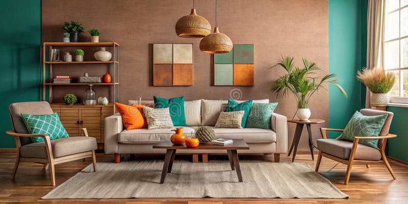
3. Dive into Deep Emerald Green
Emerald green brings drama and harmony, especially in lush garden spaces. It’s a luxurious choice that feels at once sophisticated and earthy.
Drench your space with:
- Dark green outdoor sofas or dining sets.
- Green painted fences or feature walls.
- Matching textiles like umbrellas, tablecloths, and cushions.
Why it works: Green complements plant life while adding elegance. It also works year-round—cool in summer, cozy in winter.
Emerald green brings a striking balance of bold drama and natural harmony, especially when used in outdoor spaces surrounded by vegetation. This deep, jewel-toned color evokes a sense of timeless luxury while still feeling grounded and organic, making it an ideal choice for those looking to elevate their garden, patio, or backyard without overpowering the natural beauty of the surroundings. It pairs seamlessly with leafy textures and flowering blooms, helping everything in your space feel cohesive, fresh, and intentionally designed.

To drench your outdoor area in emerald green, consider larger statement pieces like dark green outdoor sofas, loungers, or a full dining set. These not only anchor the space visually but also create a cozy, rich setting that invites relaxation and conversation. For a more architectural touch, paint fences, trellises, or even a pergola in this lush shade to add a bold frame to your outdoor landscape. Emerald-painted walls or privacy screens can also serve as stunning focal points while blending into the natural environment.
What makes emerald green such a smart color choice is its versatility across seasons. In the heat of summer, it provides a cooling visual backdrop that contrasts beautifully with bright florals or terracotta pots. In the colder months, it feels rich and inviting, giving your outdoor space a sense of warmth and comfort. Whether you’re designing a minimalist garden, a lush jungle-inspired retreat, or a romantic outdoor dining nook, emerald green offers a perfect mix of elegance and earthiness that never goes out of style.
4. Sun-Kissed Yellows for a Joyful Glow
Want to create a cheerful and inviting space? Yellow does it best. It’s a color that radiates optimism and warmth.
How to infuse yellow:
- Use mustard or golden yellow for patio walls or doors.
- Add citron-colored seating and umbrellas.
- Include yellow candles, pottery, and floral arrangements.
Why it works: Yellow reflects sunlight beautifully and instantly lifts the mood—great for social spaces and morning coffee corners.
If your goal is to craft a space that feels lively, bright, and full of joy, yellow is your perfect ally. This vibrant hue is often associated with happiness, energy, and positivity, making it an excellent choice for outdoor areas where you want to encourage relaxation, laughter, and good vibes. Whether you’re working with a compact balcony, an expansive garden, or a cozy patio nook, yellow can breathe life into any corner, transforming it from dull to delightful with just a few thoughtful touches.

Beyond paint, furniture and accessories offer a world of opportunity to layer in yellow in varying intensities. Citron-colored lounge chairs, cushions, or a bright umbrella can make a strong, joyful statement. Pair them with neutral bases like wood, rattan, or white metal to keep the overall look grounded and elegant. For more subtle additions, try incorporating yellow in small decor items like ceramic planters, vibrant tableware, or linen napkins. Even fresh yellow flowers—think marigolds, sunflowers, or daffodils—can add just the right pop of color.
What makes yellow particularly effective outdoors is how beautifully it plays with sunlight. As the natural light changes throughout the day, yellow surfaces seem to glow, making your space feel dynamic and alive. It energizes morning routines and brings warmth to late afternoon gatherings, making it ideal for places where people naturally come together—like breakfast nooks, garden benches, or alfresco dining spots. Its mood-lifting power is undeniable, and when used well, yellow can turn your outdoor space into a happy, welcoming retreat that feels like sunshine—even on cloudy days.
5. Romantic with Rosy Pinks and Corals
For something whimsical or romantic, pinks and corals can transform your outdoor setting into a feminine, cozy retreat.
Color drenching tips:
- Paint walls or decks in soft coral or blush pink.
- Add floral cushions, drapes, and rugs in similar hues.
- Go bold with a pink-tinted pergola or umbrella.
Why it works: Pink adds warmth and charm without overwhelming. Coral, in particular, glows beautifully in golden hour light.
Start by choosing a base tone that fits your overall aesthetic—blush pink, peach, salmon, or a dusty rose can all set a beautiful foundation. Painting a garden wall, fencing, or wooden deck in a soft coral hue creates an inviting canvas that feels both cozy and chic. Unlike bolder primary shades, these colors are versatile and subtle enough to use liberally, offering a color-drenched look that doesn’t feel overpowering or garish. They work especially well in smaller spaces, where their warmth can make things feel more expansive and open.

Textiles are another fantastic way to layer these colors throughout your outdoor retreat. Think floral or striped cushions in pink and coral shades, gauzy drapes to frame pergolas or verandas, and rugs that blend multiple warm tones into one cohesive scene. These details not only tie your space together visually but also add softness, texture, and an undeniably cozy feel. Don’t shy away from mixing patterns and textures—the goal is to evoke a carefree, storybook-like ambiance that feels lived-in and loved.
What makes pinks and corals particularly enchanting is their emotional resonance. They create a space that feels affectionate and welcoming, ideal for moments of relaxation, conversation, and connection. Whether you’re sipping tea under a coral canopy or lounging among pink blooms, you’ll find that these shades wrap your outdoor environment in a sense of serenity and charm that’s hard to resist.
6. All-White for a Modern, Mediterranean Vibe
A fully white outdoor space feels clean, airy, and refreshing. It’s a minimalist dream and a nod to Greek island courtyards or Moroccan rooftops.
Create your whitewashed haven:
- Paint everything from walls to outdoor furniture in matte white.
- Use white cushions, drapes, and ceramic accents.
- Add texture with white-washed wood or pebbled flooring.
Why it works: White reflects light, stays cool, and pairs beautifully with vibrant greenery or bright accent colors.
Furnishings should follow the same theme. Opt for white-painted metal or wood furniture with clean, simple lines to maintain a minimalist feel. White cushions and upholstery can be layered in with different shades of cream or ivory for subtle depth. Throw in gauzy white drapes for a breezy, Mediterranean vibe, and incorporate accessories like white ceramic planters, lanterns, or light fixtures to complete the tone-on-tone look. These neutral layers not only create visual continuity but also make the space feel cooler and more breathable on hot days.
Texture becomes especially important in an all-white outdoor space. To keep it from feeling flat or sterile, mix materials and finishes—whitewashed wooden benches, woven cotton or linen textiles, pebbled flooring, or even rough plaster walls. Each surface catches light differently, creating a dynamic space that feels alive despite the monochrome palette. The play of shadow and sunlight across textured white surfaces brings a sense of movement and softness, particularly in the early morning or late afternoon.
Ultimately, a white-drenched outdoor space is more than just a style choice—it’s a mood. It invites stillness, simplicity, and reflection. Whether you’re hosting a sunlit brunch, reading quietly in a shaded nook, or stargazing from a whitewashed terrace, this kind of space encourages a slower, more mindful way of being.
7. Tropical Vibes with Teal and Aqua
Teal and aqua shades channel island energy and bring instant vacation vibes to your backyard.
How to bring it in:
- Paint your patio walls or privacy screens in aqua.
- Choose teal cushions, planters, and tableware.
- Add aqua lanterns, tiles, or even a painted deck floor.
Why it works: These oceanic shades are energizing but relaxing, and they mesh well with sandy neutrals, rattan, and palm prints.
Teal and aqua are the ultimate feel-good colors when it comes to transforming an outdoor space into a personal oasis. These ocean-inspired hues instantly call to mind tropical waters, gentle waves, and lazy days spent lounging under palm trees. They carry with them the essence of vacation—calm, refreshing, and just playful enough to make your space feel like a getaway, even if it’s right in your backyard. Whether you’re styling a coastal retreat, a poolside patio, or just want to inject a bit of fun and tranquility into a city balcony, teal and aqua tones deliver that breezy, sun-kissed energy effortlessly.
Once your canvas is set, layer in textiles and accessories in complementary tones. Teal and aqua outdoor cushions, loungers, umbrellas, and rugs infuse the space with movement and depth, especially when mixed with crisp whites or sandy beige tones. These shades also look stunning when applied in glossy or glazed finishes—think ceramic planters, mosaic tiles, or colorful lanterns scattered around the patio. For dining areas, teal tableware and aqua glassware give your tablescape a fresh, festive touch.

The reason these shades work so well is because they strike a balance between energy and serenity. Aqua has a light, uplifting quality that feels youthful and clean, while deeper teals ground the space with richness and elegance. Together, they evoke the layered colors of the sea and sky—soft enough to relax the mind, vibrant enough to keep the mood lively. Their cool temperature makes them ideal for hot climates, helping the space feel fresh even in the summer heat.
Whether you’re sipping cocktails on a teal sofa or enjoying a sunset meal surrounded by aqua accessories, this palette turns everyday moments into mini vacations. It encourages relaxation without being sleepy, and it makes even the simplest patio feel curated and alive. With just a few splashes of these beachy tones, your backyard can feel like a breezy retreat that invites you to unwind and recharge, day after day.
8. Rich and Moody Charcoal or Navy
For a dramatic, high-contrast look, go dark with charcoal grey or navy blue. It creates an intimate, chic ambiance.
Ways to pull it off:
- Paint your pergola or exterior walls in charcoal.
- Choose dark rattan or metal furniture with matching cushions.
- Add string lights or metallic accents for contrast.
Why it works: Dark tones absorb light and make a space feel cozy and enclosed, perfect for evening entertaining or a private retreat.
Going dark outdoors may seem bold, but charcoal grey and navy blue can bring an unexpectedly refined elegance to your space. These deep, moody hues provide a strong visual anchor that grounds everything around them, making plants appear lusher, textures feel richer, and lighting stand out more dramatically. They evoke a sense of depth and calm, turning even the most open yard into a stylish, secluded nook that feels intentionally designed. This approach is perfect if you’re after a more modern, urban-inspired atmosphere or want your garden or patio to transition effortlessly from day to night.
Once your foundational tones are in place, build the mood with furniture and accents in coordinating hues. Dark rattan or powder-coated metal furniture in black, slate, or navy blends seamlessly while adding sleek lines and subtle texture. Cushions and upholstery in matching or slightly lighter tones help maintain cohesion without making the space feel too heavy. Introduce materials like leather, canvas, or woven fabrics for added depth.

Lighting plays a crucial role in darker outdoor spaces. Since dark colors absorb light, strategic illumination is key. Think warm string lights draped across the ceiling, metallic lanterns, or sculptural floor lamps with golden glows that soften and warm up the cool tones. Brass, copper, and gold accents work especially well here, offering a luxurious contrast that shimmers beautifully against the inky backdrop.
Whether you’re crafting a moody modern lounge, a sleek alfresco dining area, or a minimalist reading corner tucked away in the shade, using charcoal and navy offers a polished yet inviting aesthetic. It’s a sophisticated take on outdoor living—one that embraces the richness of shadow and the play of light—and it can completely transform how you experience your exterior space after sunset.
9. Monochrome Magic with Shades of One Color
You don’t have to stick to just one exact color. Instead, play with a monochromatic palette—using lighter and darker shades of the same hue for depth and cohesion.
Drench like this:
- For blue: combine navy, cobalt, and sky blue.
- For green: use forest, sage, mint, and olive.
- For pink: blend blush, rose, and dusty mauve.
Why it works: It creates visual interest while keeping your palette unified and elegant.
You don’t have to limit yourself to a single tone when embracing color drenching—playing within a monochromatic palette can add layers of richness without overwhelming the eye. By working with variations of the same color, you can create visual interest, a sense of movement, and a much more dynamic outdoor space. The technique is especially effective if you want harmony and unity while still giving your space personality and depth.

Greens offer an incredibly versatile palette, especially for garden spaces. Forest green provides grounding and drama, while sage and mint introduce calm, spa-like vibes. Add olive for warmth and an organic touch that feels timeless. Together, these shades can transform your backyard into a lush sanctuary, where each element builds upon the next without clashing. Mixing these greens across walls, furniture, cushions, and foliage accents enhances the sense of layering and intentionality.
This tonal layering approach works because it mimics how color naturally appears in the world—subtle shifts and gradients rather than stark contrasts. It also allows you to get creative without venturing too far outside your comfort zone. By focusing on variations of one base color, the design remains coherent and soothing, while still offering dimension and intrigue. Whether you’re going for calming, playful, or moody, this method helps you strike the perfect balance between unity and expression.
10. Playful Pops with a Single Neon Color
For the bold at heart, consider color drenching with neon brights—like electric pink, lime green, or tangerine.
Ideas to go bold:
- Paint a garden wall or outdoor bar in neon.
- Use bright seating, planters, or outdoor rugs.
- Add colorful LED lighting for nighttime impact.
Why it works: Neon adds modern energy and works especially well in small spaces or party areas where you want maximum fun.
Electric pink, for instance, brings a daring pop that feels trendy and youthful, especially when used on feature furniture or accent walls. Lime green adds a zesty freshness, almost like injecting your backyard with a dose of tropical punch. And tangerine? It channels summertime heat and happiness like nothing else, creating a setting that feels both warm and energizing. These colors work especially well when contrasted with neutrals or cool greys to ground the look and prevent sensory overload.

What makes neon especially effective is its ability to transform even the most compact areas. Small balconies, patios, or rooftop corners can feel completely reimagined with just a few bright accents. Because these colors bounce light and contrast strongly with greenery, they enhance dimension and energy in a way that neutral palettes simply can’t. Whether you’re designing an outdoor dance space, a cocktail nook, or just want something that sparks joy every time you step outside, neon is an unapologetic celebration of color and creativity.
Bonus Tips for Successful Outdoor Color Drenching
Color drenching works best when executed with intention. Here are some extra ideas to make your space shine:
- Use paint strategically – Paint walls, fences, decks, or pergolas in your chosen hue for instant transformation.
- Textiles are key – Layer cushions, outdoor rugs, curtains, and throws in matching tones for softness and comfort.
- Coordinate your accessories – Choose planters, lanterns, tableware, and even plant choices to reflect your color theme.
- Balance with neutrals or greenery – If your color feels overwhelming, break it up with wood tones, white accents, or leafy plants.
- Consider lighting – Use solar lights, candles, or LED strings in a matching or complementary tone to enhance your space at night.
Here’s a clean and well-structured Table of Contents in table format for your article:
| Section | Title |
|---|---|
| 1 | Go Bold with Cobalt Blue |
| 2 | Embrace Earthy Terracotta Tones |
| 3 | Dive into Deep Emerald Green |
| 4 | Sun-Kissed Yellows for a Joyful Glow |
| 5 | Romantic with Rosy Pinks and Corals |
| 6 | All-White for a Modern, Mediterranean Vibe |
| 7 | Tropical Vibes with Teal and Aqua |
| 8 | Rich and Moody Charcoal or Navy |
| 9 | Monochrome Magic with Shades of One Color |
| 10 | Playful Pops with a Single Neon Color |
| Bonus | Tips for Successful Outdoor Color Drenching |
Let me know if you’d like each title linked or styled for a website/blog format.
FAQs: Color Drenching Your Outdoor Living Space
What is color drenching?
Color drenching is a design technique where you use one color (or varying tones of one hue) across most or all elements in a space—walls, furniture, textiles, and accessories—to create a bold, unified look.
Does color drenching make small outdoor spaces feel bigger or smaller?
It depends on the color used. Light colors like white or pastels can make a space feel larger and more open, while dark or bold colors make it feel cozy and intimate.
Is it okay to mix some contrasting colors?
Yes! While the base of color drenching is a dominant hue, using small accent colors (like metallics or neutrals) adds depth and interest without disrupting the theme.
Will bold colors fade quickly outdoors?
They can fade over time due to UV exposure. Use outdoor-safe, UV-resistant paints and fabrics to help retain color longer.
Can I try color drenching without painting?
Absolutely! Start with textiles and accessories—cushions, rugs, planters, umbrellas—before committing to paint. You’ll still get a strong effect.
Conclusion: Make Your Outdoor Space a Statement
Color drenching is more than a trend—it’s a transformative design strategy that brings style, mood, and cohesiveness to your outdoor living space. Whether you want a serene monochromatic lounge or a bold, neon-lit party patio, this technique offers endless creative freedom.
By choosing a palette that resonates with your personal taste and surrounding landscape, you can turn even the simplest balcony or garden corner into a vibrant oasis that reflects your vibe and invites people in.
So go ahead—ditch the beige and dive into color. Your outdoor space is ready to shine.
Would you like me to design a visual guide or Pinterest-style board for these ideas?
Leave a Reply